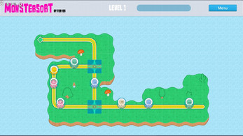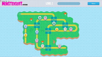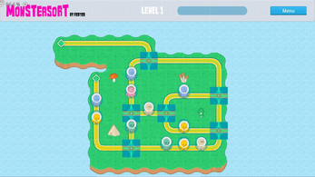
Monster Sort
Type of game: Puzzle game.
Average Time: 10 minutes.
How To: The objective is to match the pairs of monsters (by color).Use the selector to change between the diferents possible paths. (there's a better in-game how to play)
-------------------------
CREDITS
-------------------------
Motor: Godot Engine 4.0.3 https://godotengine.org/
Idea & GameDev: Ferter https://www.youtube.com/@fertakusM
Fonts: https://www.1001freefonts.com/
Assets/Audios: https://kenney.nl/
| Status | Released |
| Platforms | HTML5 |
| Author | Fertakus |
| Genre | Puzzle |
| Made with | Godot |
| Tags | 2D, Casual, cool, Funny, Godot, Indie, Monsters, Pixel Art, Short, Singleplayer |
| Average session | A few minutes |
| Languages | English |
| Inputs | Mouse, Touchscreen, Smartphone |
| Accessibility | Color-blind friendly, High-contrast, Interactive tutorial, Textless |
| Links | YouTube |
Development log
- Easy Mode + Better TutorialNov 08, 2023
- GizmoZen Idea2 + newLevelNov 07, 2023
- GizmoZen IdeaNov 06, 2023
- Fixed Colision Bug!Nov 06, 2023
- Update!Nov 06, 2023


Comments
Log in with itch.io to leave a comment.
Juegazo
Gracias Crack! :) :)
Interesante el camino que acabó tomando la mecánica de base, volviéndose más un juego de puzzle de memoria y coordinación. A pesar de los elementos que faltan por pulir, es un juego bastante retador y entretenido ÒwÓ
Muchas gracias JodaDev por probarlo!
Si.. al final a surgido eso que dices, un juego de "memoria y velocidad con el ratón".
Le dedicaré algunos updates más para intentar mejorar la jugabilidad (un buen tutorial, 4 pantallitas más assequibles y poco mas..). Aunque soy evidentemente consciente de que este juegono va a ir a ningun lado, pues.. almenos dejarlo lo mas "redondo" posible.
Un saludo crack!
Muy original, me parecio entretenido, y divertido!!
Gracias por compartir!
Gracias crack por darle una oportunidad! ahahahaha
Un videojuego... por prqueño y cutre que sea... sin nadie que lo pruebe no tiene ningún sentido!
Así que todo un placer si te ha entretenido 2 minutos almenos!
Un saludo!
Good idea, it has potential!
Here's an idea to improve the user experience, see what you think.
I would try to make the spawn point of the monsters change to the colour of the next monster, so the player could have a little more margin.
Un saludo ;)
I Like it !!
And... I did it ... so fast !!
It was only 3 line of code and one *.png for each color.
Thanks for the Idea !
Next challenge?
Gracias crack, un saludo!
This is really good customer service 😃!
...maybe something similar with intersections, marking in some way what the next path to change to would be before clicking.
I don't know if I explain myself?
I think i got'ya!
Now u can see the next selector path before click it!
Really love your feedback.
¿next challange? XD
Inspired by your first tip, now there's a new level with a "new mechanics"
The Gizmo Zpeed level,
No apto para cardíacos xD
Saludos!
Lol, thank you very much for the tribute.
This is a very personal opinion, and it's possible that the approach may not align with your vision. If you don't want to proceed in this direction, I would completely understand...
...here's my suggestion: if it's a puzzle game, I think it would make sense to be able to see the queue of monsters to appear (all of them, not just a hint like it is now). It would make it more of a puzzle and less like an arcade game.
Un saludo!Hi again!
Un saludo!
I think level 3 is actually impossible? I think the second blue guy should be swapped with the only pale brown guy, because one of the pink guys is in the way.